Return to flip book view
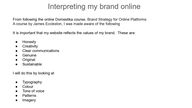
Interpreting my brand onlineFrom following the online Domestika course, Brand Strategy for Online PlatformsA course by James Eccleston, I was made aware of the followingIt is important that my website reflects the values of my brand. These are:● Honesty● Creativity● Clear communications● Genuine● Original● SustainableI will do this by looking at● Typography● Colour● Tone of voice● Patterns ● Imagery
TypographyOne of my core values is to have clear communications.I would therefore like my website to be simple and easy to read and use.I will investigate fonts that will reflect this value.I researched fonts on myfonts.com and decided to choose a sans serif font for it’s simplicity and because this style is easier to readI am thinking of using Adobe Portfolio for my website so I will look at which fonts are available free and whether it would be worth purchasing a font for the websitehttps://www.myfonts.com/pages/sans-serif-fonts
I found a review of Adobe fonts dated last month so I took screenshots of my favourite fonts that I feel will reflect my brandhttps://www.typewolf.com/adobe-fonts accessed 10-09-23
Colour PalletThings to consider● Typography● Colour theory● Primary and secondary colours, accent colours● Tones and shades● Colour associations● Proportions● Patterns ● ImageryI will collect some references and images and produce a mood board for my website
Mood board
Image references for moodboard - all accessed 11-09-23https://stock.adobe.com/ttps://bethanyalicedesigns.comLABARTE – Labarte (labartemx.com)https://www.pinterest.co.uk/aeolidia/color-palette-inspiration/My own artworkMy own eco printed textilehttps://www.liveauctioneers.com/news/auctions
Common colour associationsThe below color associations can be used as a reference guide as you consider which colors would best represent a particular brand. How should the target audience feel when they encounter the brand's website? What actions should they take? With the right context, color could make the difference between an engaged potential customer and a disinterested passerby.● Red: passion, power, love, danger, excitement● Blue: calm, trust, competence, peace, logic, reliability ● Green: health, nature, abundance, prosperity● Yellow: happiness, optimism, creativity, friendliness● Orange: fun, freedom, warmth, comfort, playfulness● Purple: luxury, mystery, sophistication, loyalty, creativity● Pink: nurturing, gentleness, sincerity, warmth● Brown: nature, security, protection, support● Black: elegance, power, control, sophistication, depression● White: purity, peace, clarity, cleanlinesshttps://www.flux-academy.com/blog/how-to-strategically-use-color-in-website-design. Accessed 11-09-23
Here, companies chose three colours for their palette: a main (or primary) colour, secondary colour, and accent colour. Then, use the 60/30/10 rule to apply these colors in your website design. According to this rule, 60% of the color used should be the main color, 30% the secondary color, and 10% the accent colour. Below are some examples of websites that incorporate this ruleThe 60/30/10 color rule.Dominant purple with teal used as an accentSpendesk uses purple as their main color, white as their secondary colour, and teal as their accent colour.Dominant green paired with a nice salmon as an accentGreenlist uses green as their main colour, white as their secondary color, and pink as their accent colourDemuxed leads with Yellow and pairs that with black and whiteDemuxed uses yellow as their main color, black as their secondary color, and white as their accent colour.