Return to flip book view
Wholesale $10 ADA Signs from
ADA Sign Products
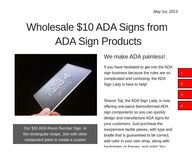
Our $10 ADA Room Number Sign in
the rectangular shape. Join with other
component parts to create a custom
ADA sign by adding contrasting colors.
If you have hesitated to get into the ADA sign business because the rules are so complicated and confusing, the ADA Sign Lady is here to help!
Sharon Toji, the ADA Sign Lady, is now offering one-piece thermoformed ADA sign components so you can quickly design and manufacture ADA signs for your customers. Just purchase the inexpensive tactile pieces, with type and braille that is guaranteed to be correct, add color in your own shop, along with backplates or frames, and voila! You
are in the ADA business.
Just $10.00 gets you started with a room number piece, and you have a choice of shapes: oval, circle, rectangle or square.
Or, if you prefer, we can add color, and ship you a complete sign, ready to sell.
We make ADA painless!May 1st, 2013
1
2
3
4
Why Thermoforming?
A true one-piece tactile sign has always been the goal. Although you hear photopolymer and sand carved signs touted as "one piece," they actually are made up of different layers of material. Those layers are sensitive to moisture and sunlight. It's best not to install them outside.
Inlaid "raster" braille signs can be difficult to destroy if they are carefully made, with high quality adhesives, but a vandal, if determined, can pry characters and braille dots out.
Of course cast and etched metal signs are truly one piece. However, not only are they very expensive, but they must be painted, and paint will eventually wear away. On top of that, it's very difficult to make rounded braille dots and beveled characters in metal.
The search for the one-piece signEnter thermoforming! Thermoformed signs are truly one piece, molded by heat and pressure into one piece plastic sign panels, with rounded braille, and raised characters that have beveled or rounded stroke profiles, making them exceptionally easy to read by touch.
Since the signs can be molded from clear plastic, all color can be added subsurface, making the signs exceptionally vandal proof, and impervious to wear and tear and weathering.
Recycled plastics can be used, and reject signs can be remolded, although those signs will need to have surface color. Molds are easy to create inexpensively, so custom designs are not a problem.
May 1st, 2013
1
2
3
4
ADA PermaSign™
Our PermaSign has a 10 year warranty, as long as all color is applied to the second surface.
Tactile characters can have either beveled or rounded stroke shapes, and the color of the character is placed directly behind the thermoformed raised image.
The background can be a solid color, or have any kind of graphic image that does not obscure the text and provides good contrast.
It's easy to create an area for a changeable insert in the sign background, so the client can easily change the room function, or the occupant's name and title, using their own printer.
The sign can be installed indoors or out.
The best warranty you can get!A beautiful scenic photograph forms the contrasting background for this room identification sign. All color is applied on the second surface. This ADA PermaSign™ is mounted on a wood frame.
May 1st, 2013
1
2
3
4
You can barely make out the tactile characters
and braille on this InvisiTouch™ sign, but for functionally blind readers, it's just the right size.
The name and title are on a removable insert,
so it is easy to change when necessary.
One of the big problems with ADA signs has always been that what is best for "touch readers" has not been as helpful for those people with some usable vision.
The two groups of legally blind people really need two different kinds of signs. Now, the new ADA rules allow that, and our version is called "InvisiTouch."
The visual portion of the sign is larger and bolder, and uses upper and lowercase text where possible. Dark/light contrast and a non-glare finish is vital.
The tactile portion is smaller, with slender, easy to read rounded stroke shapes, all in uppercase sans serif fonts. Because it doesn't need to be seen, we can ignore contrast and glare on the tactile portion.
1
2
3
4