Return to flip book view
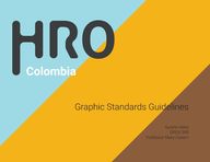
Graphic Standards Guidelines Aurelio Velez GRDS 395 Professor Mary Casem Page 1
Graphic Standards Guidelines Aurelio Velez GRDS 395 Professor Mary Casem Page 1
Our Mission As a non profit organization HRO mission is to connect the government volunteers and the private sector to ensure that everyone has the same basic resources as their disposal such as water energy and proper sewage More than half of the people that suffer from lack of basic resources live in rural areas this is why getting this service to them is close to impossible HRO solution its to connects the people with the economic power and local entities to help get everyone have the same basic resource HRO Graphic Design Standards Aurelio Velez Page 5
Our Mission As a non profit organization HRO mission is to connect the government volunteers and the private sector to ensure that everyone has the same basic resources as their disposal such as water energy and proper sewage More than half of the people that suffer from lack of basic resources live in rural areas this is why getting this service to them is close to impossible HRO solution its to connects the people with the economic power and local entities to help get everyone have the same basic resource HRO Graphic Design Standards Aurelio Velez Page 5
Our Logo R 157 G 218 B 229 C 36 M 0 Y 0 K 0 9ddae5 Our logo symbolizes what we are fighting for everyone to get the same basic resources at their disposal we have target this by creating an interactive logo that everyone can sympathize with We have taken out the first letter from our main name Human Resources Organization and compiled it in one word by having only 3 letters we make it more suitable for people to remember Colors where specific chosen regarding the organization target its main three objective Water Energy and Proper Sewage When using the logo in any application please refer to the colors on the side use each color as shown for the H use the blue indicated for the R use yellow indicated for the O use the brown indicated and for any tag underneath please use the grey indicated HRO Graphic Design Standards Aurelio Velez R 139 G 94 B 60 C 35 M 60 Y 80 K 25 8b5e3c R 224 G 178 B 27 C 3 M 32 Y 100 K 0 f4b21b R 60 G 60 B 61 C 69 M 62 Y 60 K 50 3c3c3d Page 7
Our Logo R 157 G 218 B 229 C 36 M 0 Y 0 K 0 9ddae5 Our logo symbolizes what we are fighting for everyone to get the same basic resources at their disposal we have target this by creating an interactive logo that everyone can sympathize with We have taken out the first letter from our main name Human Resources Organization and compiled it in one word by having only 3 letters we make it more suitable for people to remember Colors where specific chosen regarding the organization target its main three objective Water Energy and Proper Sewage When using the logo in any application please refer to the colors on the side use each color as shown for the H use the blue indicated for the R use yellow indicated for the O use the brown indicated and for any tag underneath please use the grey indicated HRO Graphic Design Standards Aurelio Velez R 139 G 94 B 60 C 35 M 60 Y 80 K 25 8b5e3c R 224 G 178 B 27 C 3 M 32 Y 100 K 0 f4b21b R 60 G 60 B 61 C 69 M 62 Y 60 K 50 3c3c3d Page 7
Our Fight Our main objective is to get everyone the same basic resources but more specifically we are targeting 3 basic resources which are Clean Water Energy and Proper Sewage therefore we have created a secondary logo for each of this divisions Each color was chosen to symbolize the meaning of the division the colors are the same on the main logo please refer to the main logo page when using this color in any applications Proper Sewage Energy Clean Water HRO Graphic Design Standards Aurelio Velez Page 9
Our Fight Our main objective is to get everyone the same basic resources but more specifically we are targeting 3 basic resources which are Clean Water Energy and Proper Sewage therefore we have created a secondary logo for each of this divisions Each color was chosen to symbolize the meaning of the division the colors are the same on the main logo please refer to the main logo page when using this color in any applications Proper Sewage Energy Clean Water HRO Graphic Design Standards Aurelio Velez Page 9
Clean Water When creating the secondary logo for Clean Water how important clean pure water is to our body by having same amount of water as blue in logo it s clear that water is a crucial the wellbeing of a person Waves were added to show how water can be found in certain places of the world HRO Graphic Design Standards Aurelio Velez Page 11
Clean Water When creating the secondary logo for Clean Water how important clean pure water is to our body by having same amount of water as blue in logo it s clear that water is a crucial the wellbeing of a person Waves were added to show how water can be found in certain places of the world HRO Graphic Design Standards Aurelio Velez Page 11
Energy When creating the secondary logo for energy we wanted to create a symbol the importance of electricity in every content not only as a form of light but also as a form of connecting those far away The energy icon is partially hidden since we wanted to show how the amount of people without energy in Colombia and how we are all together in solving this problem HRO Graphic Design Standards Aurelio Velez Page 13
Energy When creating the secondary logo for energy we wanted to create a symbol the importance of electricity in every content not only as a form of light but also as a form of connecting those far away The energy icon is partially hidden since we wanted to show how the amount of people without energy in Colombia and how we are all together in solving this problem HRO Graphic Design Standards Aurelio Velez Page 13
Proper Sewage When creating the secondary logo for Proper Sewage we wanted to show how even though there are some pipelines most of them are disconnected damage or ending in place where it shouldn t be By having the pipeline follow the form of the H we wanted to show how each small town sewage problem is unique that there is no one straight solution for every problem HRO Graphic Design Standards Aurelio Velez Page 15
Proper Sewage When creating the secondary logo for Proper Sewage we wanted to show how even though there are some pipelines most of them are disconnected damage or ending in place where it shouldn t be By having the pipeline follow the form of the H we wanted to show how each small town sewage problem is unique that there is no one straight solution for every problem HRO Graphic Design Standards Aurelio Velez Page 15
Logo Construction When creating the logo we use a very specific grid that helped us when putting each element together On the bottom of the page it s the combination of the grid and circles we use to create the logo The logo started with the typeface Roboto Bold but was then modified in almost every aspect such as the rounded corners the kerning the inside of the letter R the width of the O and other minor details HRO Graphic Design Standards Aurelio Velez Page 17
Logo Construction When creating the logo we use a very specific grid that helped us when putting each element together On the bottom of the page it s the combination of the grid and circles we use to create the logo The logo started with the typeface Roboto Bold but was then modified in almost every aspect such as the rounded corners the kerning the inside of the letter R the width of the O and other minor details HRO Graphic Design Standards Aurelio Velez Page 17
Clear Space When using the logo in any application it s important to maintain a clean space between the logo and other objects such as and image or other typeface First it s important to know the bounding box of the logo which goes from the top of the O to the bottom where the tag line rest and from the side of the H to the side of the O The letter R or the logo has place in all sides of the bounding box to show the clear space the logo should have in any application There shouldn t be the any text image or other object closer than the size of the letter R in the logo HRO Graphic Design Standards Aurelio Velez Page 19
Clear Space When using the logo in any application it s important to maintain a clean space between the logo and other objects such as and image or other typeface First it s important to know the bounding box of the logo which goes from the top of the O to the bottom where the tag line rest and from the side of the H to the side of the O The letter R or the logo has place in all sides of the bounding box to show the clear space the logo should have in any application There shouldn t be the any text image or other object closer than the size of the letter R in the logo HRO Graphic Design Standards Aurelio Velez Page 19
Minimal Size When using the logo in any application it s important to have a minimal size in order for it not to lose its readability and therefore the meaning There is a minimum size for all logos both main and secondary logo they should not be smaller than 31 pt On the side there is an example of how the logo should be reduce 2 6 pica 1 1 cm 0 4 in 31 pt HRO Graphic Design Standards Aurelio Velez Page 21
Minimal Size When using the logo in any application it s important to have a minimal size in order for it not to lose its readability and therefore the meaning There is a minimum size for all logos both main and secondary logo they should not be smaller than 31 pt On the side there is an example of how the logo should be reduce 2 6 pica 1 1 cm 0 4 in 31 pt HRO Graphic Design Standards Aurelio Velez Page 21
Color Background Yellow background Blue background HRO Energy yellow background HRO Clean Water Blue Background When using the logo in any application it s important to have a minimal size in order for it not to lose its readability and therefore the meaning There is a minimum size for all logos both main and secondary logo they should not be smaller than 31 pt On the side there is an example of how the logo should be reduce Black background HRO Graphic Design Standards Aurelio Velez Brown background Page 23
Color Background Yellow background Blue background HRO Energy yellow background HRO Clean Water Blue Background When using the logo in any application it s important to have a minimal size in order for it not to lose its readability and therefore the meaning There is a minimum size for all logos both main and secondary logo they should not be smaller than 31 pt On the side there is an example of how the logo should be reduce Black background HRO Graphic Design Standards Aurelio Velez Brown background Page 23
Typography lato Black Use for seconday tittles both capital and lower case ABCDEFGHIJKLMNOPQRSTUVWXYZ When creating a poster banner website or any other application it s important to maintain consistency in the brand therefore below are the typeface that the organization must use for any application Each typeface was chosen taking in mind it connects well with the logo and sends the right massage Each typeface has its purpose bellow each typeface is a short explanation on when to use that typeface abcdefghijklmnopqrstuvwxyz 123456789 lato Light Baloo Tamma 2 regular Use for tittles only both in capital and lowe case ABCDEFGHIJKLMNOPQRSTUVWXYZ abcdefghijklmnopqrstuvwxyz Use for all body text both in capital and lower case ABCDEFGHIJKLMNOPQRSTUVWXYZ abcdefghijklmnopqrstuvwxyz 123456789 123456789 HRO Graphic Design Standards Aurelio Velez Page 25
Typography lato Black Use for seconday tittles both capital and lower case ABCDEFGHIJKLMNOPQRSTUVWXYZ When creating a poster banner website or any other application it s important to maintain consistency in the brand therefore below are the typeface that the organization must use for any application Each typeface was chosen taking in mind it connects well with the logo and sends the right massage Each typeface has its purpose bellow each typeface is a short explanation on when to use that typeface abcdefghijklmnopqrstuvwxyz 123456789 lato Light Baloo Tamma 2 regular Use for tittles only both in capital and lowe case ABCDEFGHIJKLMNOPQRSTUVWXYZ abcdefghijklmnopqrstuvwxyz Use for all body text both in capital and lower case ABCDEFGHIJKLMNOPQRSTUVWXYZ abcdefghijklmnopqrstuvwxyz 123456789 123456789 HRO Graphic Design Standards Aurelio Velez Page 25
Incorrect Use of Logo Incorrect Use of color Incorrect Use of color Incorrect use of Logo Incorrect background Background with strong colors Background color too similar Incorrect organization When using the logo in any application it s important to show the correct massage and vision that the logo is expressing therefore using the logo correctly is key Below are some example of how NOT to use the logo such as color variation bright background and other examples Incorrect use of color Incorrect use of color Incorrect use tagline Incorrect use of color in tagline Incorrect placement Incorrect use of tagline HRO Graphic Design Standards Aurelio Velez Incorrect Use logo Page 27
Incorrect Use of Logo Incorrect Use of color Incorrect Use of color Incorrect use of Logo Incorrect background Background with strong colors Background color too similar Incorrect organization When using the logo in any application it s important to show the correct massage and vision that the logo is expressing therefore using the logo correctly is key Below are some example of how NOT to use the logo such as color variation bright background and other examples Incorrect use of color Incorrect use of color Incorrect use tagline Incorrect use of color in tagline Incorrect placement Incorrect use of tagline HRO Graphic Design Standards Aurelio Velez Incorrect Use logo Page 27
Stationary When presenting the organization to the world it s important to show its core therefore we have developed the stationary to show the organization as both a center core brand and also as its 3 different categories The letter is the same for all the organization the business cards and envelops can be change depending on the category weather its clean water energy or proper sewage each color symbolizes a different sector in the organization Jim Halpert Energy Infrastructure HRO Colombia Cl 12 7 65 Bogot Jim Halpert Energy Infrastructure HRO Colombia Cl 12 7 65 Bogot Jim Halpert Energy Infrastructure HRO Colombia Cl 12 7 65 Bogot Ben Halpert Jim Halpert Universidad Icesi Cl 32 5 85 Energy Infrastructure Bogot Colombia HRO Colombia Cl 12 7 65 Bogot Ben Halpert Universidad Icesi Cl 32 5 85 Bogot Colombia Jim Halpert Energy Infrastructure HRO Colombia Cl 12 7 65 Bogot Ben Halpert Universidad Icesi Cl 32 5 85 Bogot Colombia HRO Graphic Design Standards Aurelio Velez Page 29
Stationary When presenting the organization to the world it s important to show its core therefore we have developed the stationary to show the organization as both a center core brand and also as its 3 different categories The letter is the same for all the organization the business cards and envelops can be change depending on the category weather its clean water energy or proper sewage each color symbolizes a different sector in the organization Jim Halpert Energy Infrastructure HRO Colombia Cl 12 7 65 Bogot Jim Halpert Energy Infrastructure HRO Colombia Cl 12 7 65 Bogot Jim Halpert Energy Infrastructure HRO Colombia Cl 12 7 65 Bogot Ben Halpert Jim Halpert Universidad Icesi Cl 32 5 85 Energy Infrastructure Bogot Colombia HRO Colombia Cl 12 7 65 Bogot Ben Halpert Universidad Icesi Cl 32 5 85 Bogot Colombia Jim Halpert Energy Infrastructure HRO Colombia Cl 12 7 65 Bogot Ben Halpert Universidad Icesi Cl 32 5 85 Bogot Colombia HRO Graphic Design Standards Aurelio Velez Page 29
Poster Design When showing other people the main message of the organization it s important to have the same design language When crating a poster we wanted to create a deeper connection between a flat piece of paper and the person that its reading it therefore each poster has a personal story to tell Every poster should have the same design layout to have consistency such as placement of the tittle white spaces logo placement and what image to choose on the side are some example of the language all poster should have When placing any typography please refer page X to use the correct type for each section HRO Graphic Design Standards Aurelio Velez Page 31
Poster Design When showing other people the main message of the organization it s important to have the same design language When crating a poster we wanted to create a deeper connection between a flat piece of paper and the person that its reading it therefore each poster has a personal story to tell Every poster should have the same design layout to have consistency such as placement of the tittle white spaces logo placement and what image to choose on the side are some example of the language all poster should have When placing any typography please refer page X to use the correct type for each section HRO Graphic Design Standards Aurelio Velez Page 31
HRO Graphic Design Standards Aurelio Velez